Brand Identity
A bespoke brand identity and collateral package tailored for a private capital firm in Buffalo, NY.
Challenge
Established in 2014, Fors Holdings Inc., despite its tenure, lacked a distinct brand identity typical of a small private capital firm. The client sought to elevate their credibility with the creation of a professional website, branded social media profiles, and business cards.
The brand identity endeavor was anchored in aligning with the client's brand strategy and fundamental values:
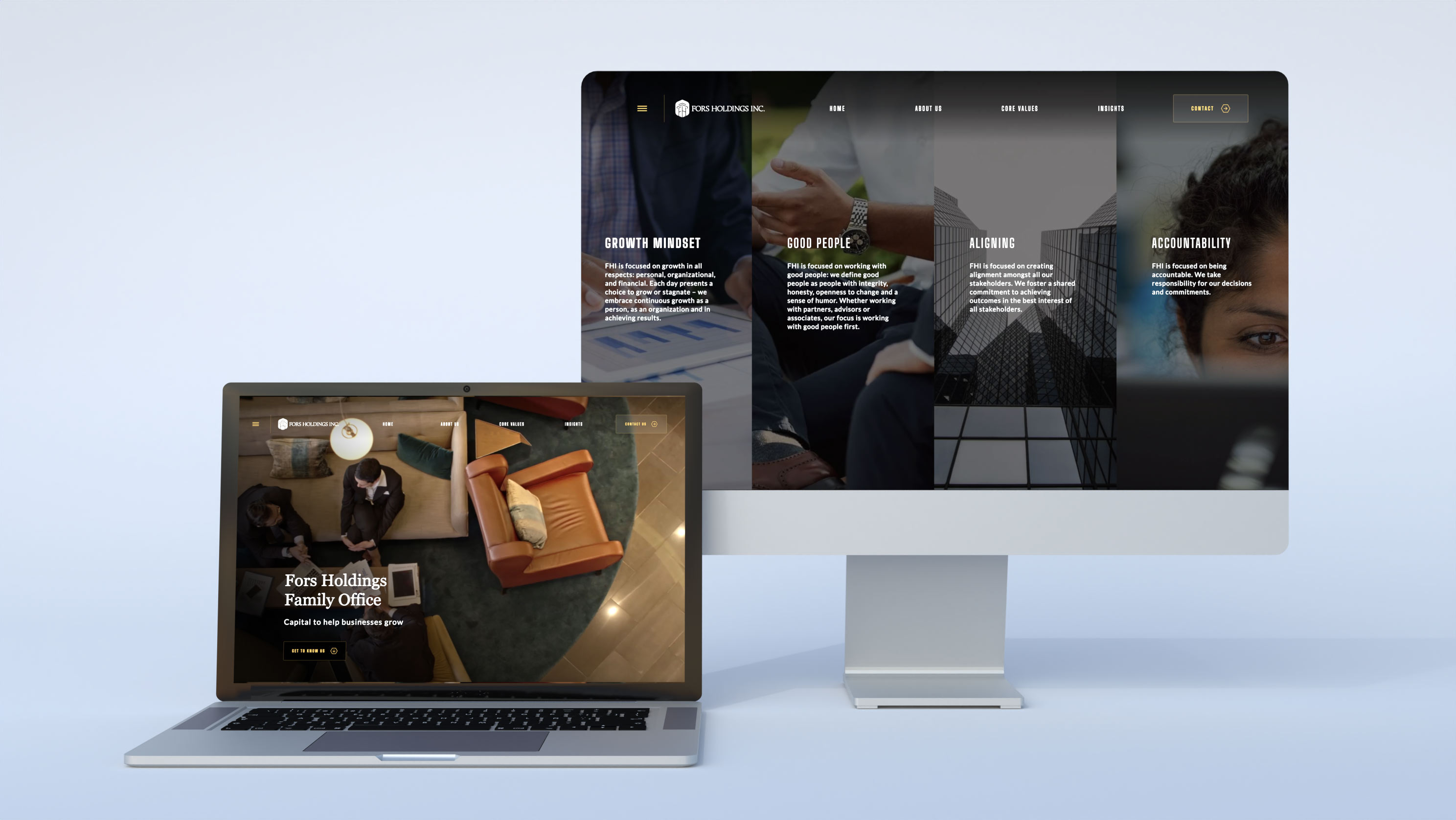
- Growth Mindset: We are focused on growth in all respects; personal, organizational, and financial. Each day presents a choice to grow or stagnate—we embrace continuous growth as a person, as an organization and in achieving results.
- Good People: We define good people as people with integrity, honesty, openness to change and a sense of humor. Whether working with partners, advisors or associates, our focus is working with good people first.
- Aligning: We are focused on creating alignment amongst all our stakeholders. We foster a shared commitment to achieving outcomes in the best interest of all stakeholders.
- Accountability: We are focused on being accountable. We take responsibility for our decisions and commitments.
Solution
A tailored brand identity suite was crafted to harmonize with the client's brand strategy and resonate with their core values. This comprehensive package comprised:
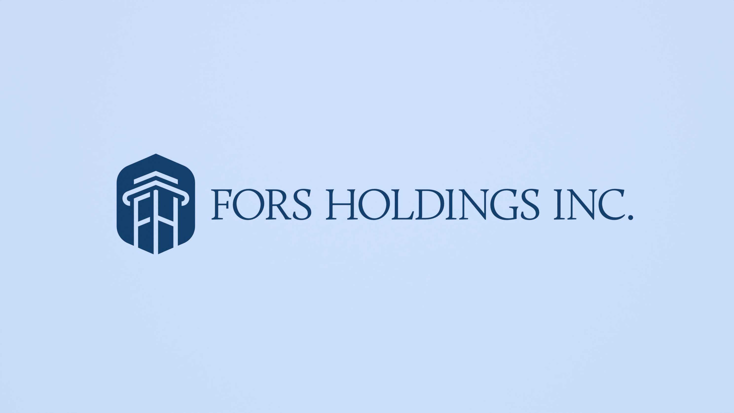
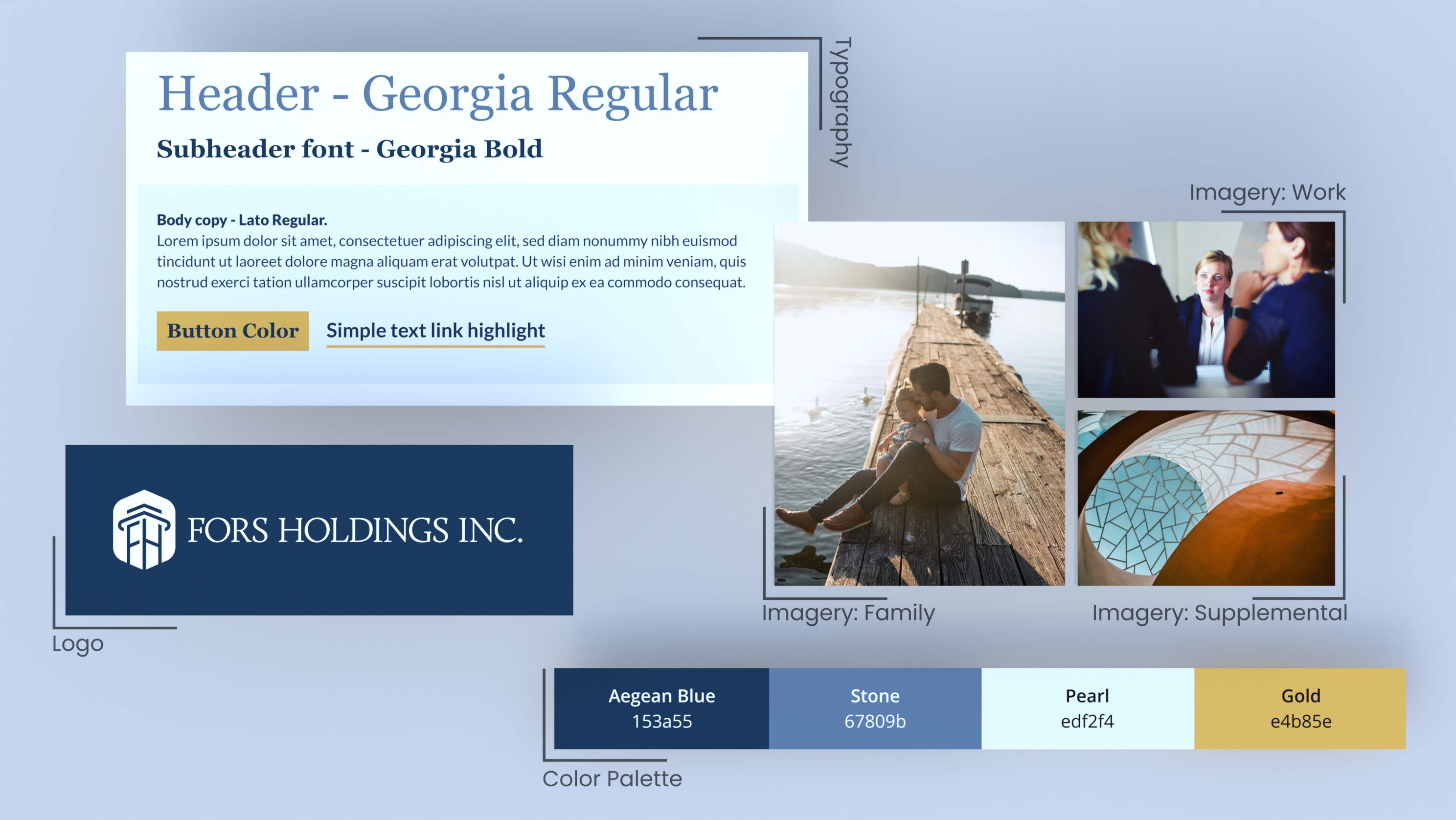
- Logo: The emblem showcases a crest adorned with a contemporary interpretation of an Ionic column, symbolizing stability and prosperity. Intertwined within the column are the initials "F" and "H," reinforcing the brand identity. The column itself embodies the resilience of a robust financial institution, poised to offer unwavering support.
- Color Palette: A palette rich in hues evocative of wealth and reliability was curated to unify the brand. Predominantly cool blue tones evoke the solidity of stonework, accentuated by touches of gold.
- Typography: The choice of Georgia for headers and prominent callouts complements the wordmark. For smaller body text, Lato—a sans-serif font—was selected to optimize legibility.
- Imagery Guidelines: Emphasizing natural lighting, the imagery guidelines focus on three main themes: Family (emphasizing positivity, forward thinking, and financial security), Work and Finance (projecting optimism and forward momentum), and Supplementary Dynamic Places/Things (illustrating growth, adaptability, positivity, and enduring stability over the long term).
Following the finalization of the brand identity, assets were seamlessly extended to website development, business card design, and the creation of captivating social media banners and content, cementing Fors Holdings Inc.'s brand presence across various platforms.


