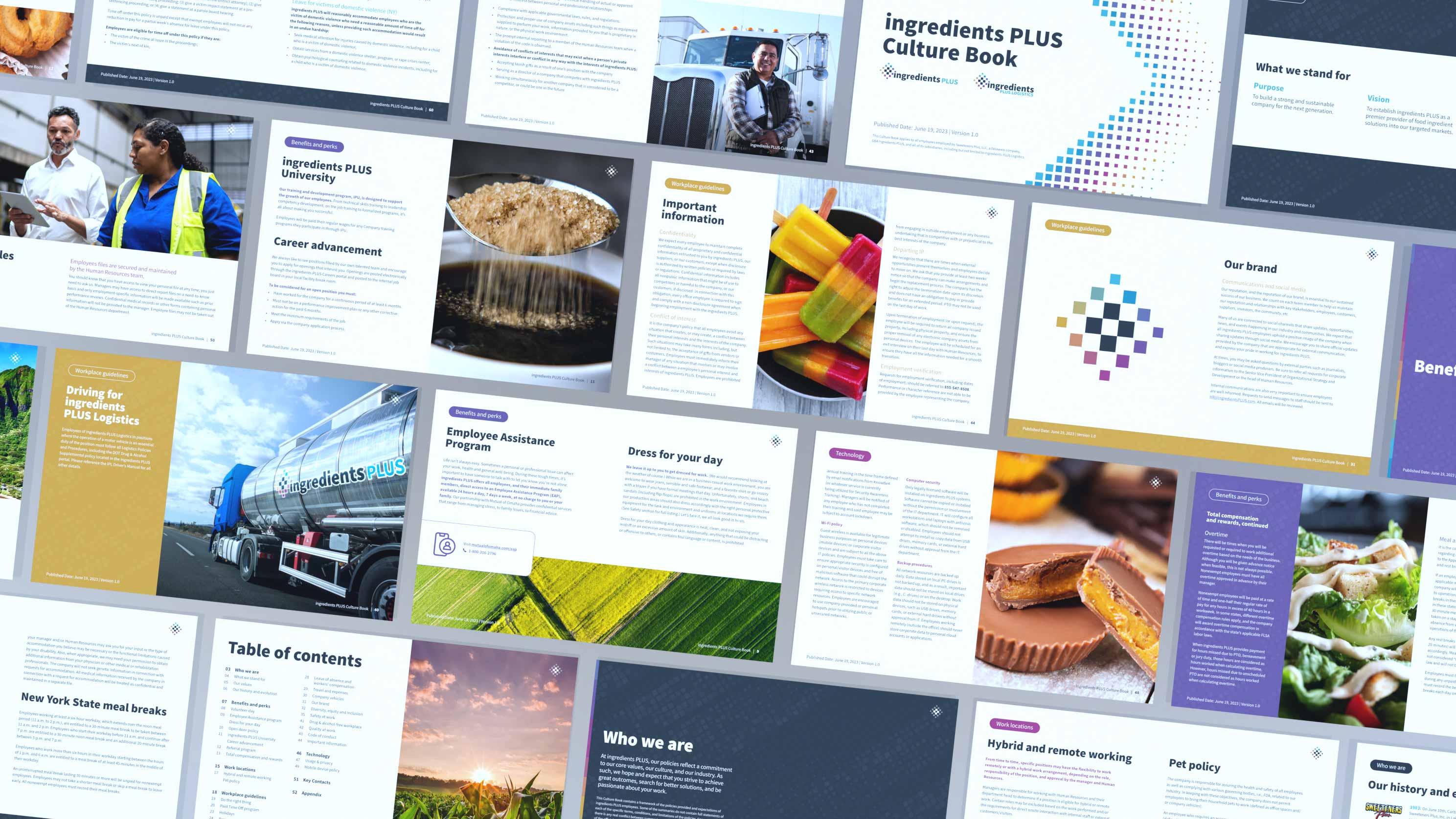
Employee Handbook
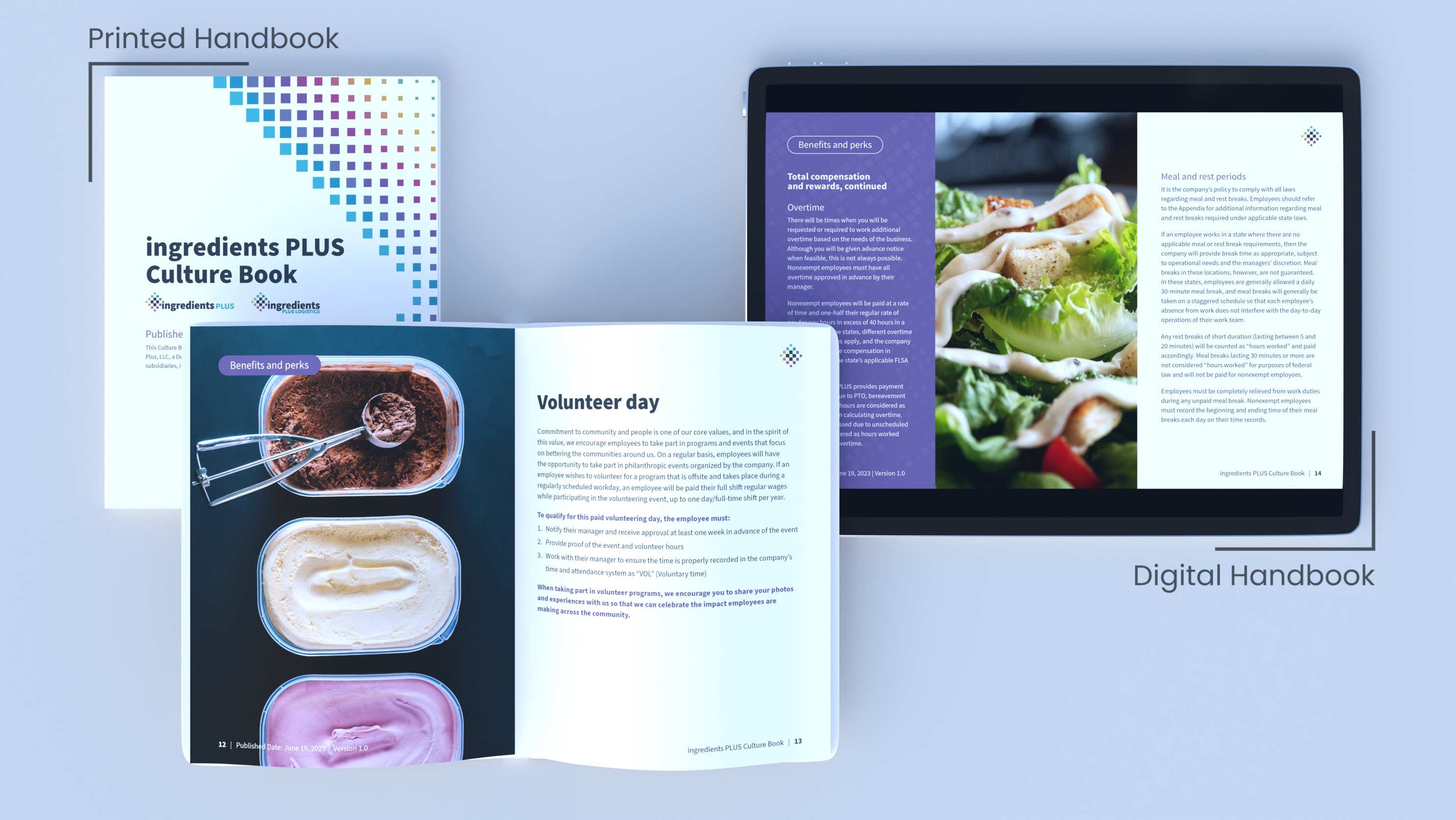
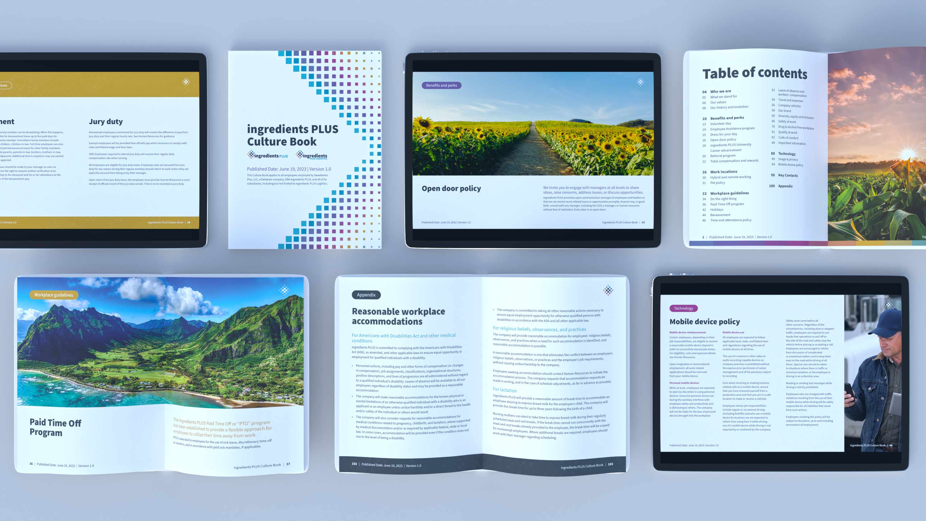
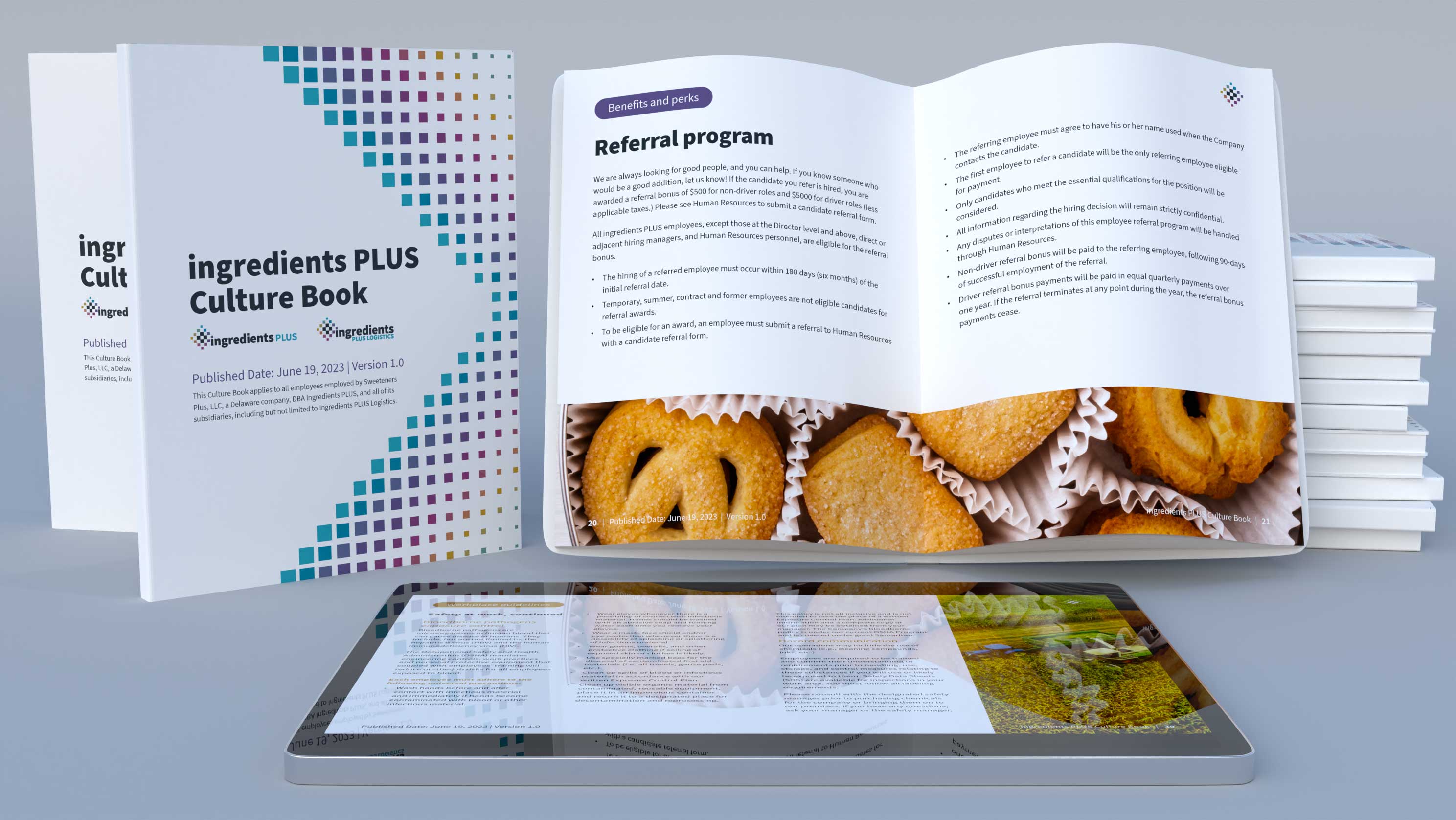
Crafted after a significant rebranding of a leading raw ingredients company, this project entailed the creation of a comprehensive employee handbook, tailored for both print and digital formats.
Challenge
Following the rebranding of Sweeteners Plus to ingredients PLUS, which aimed to better represent their widened range of raw ingredient offerings, the project necessitated a refresh of their brand guidelines.
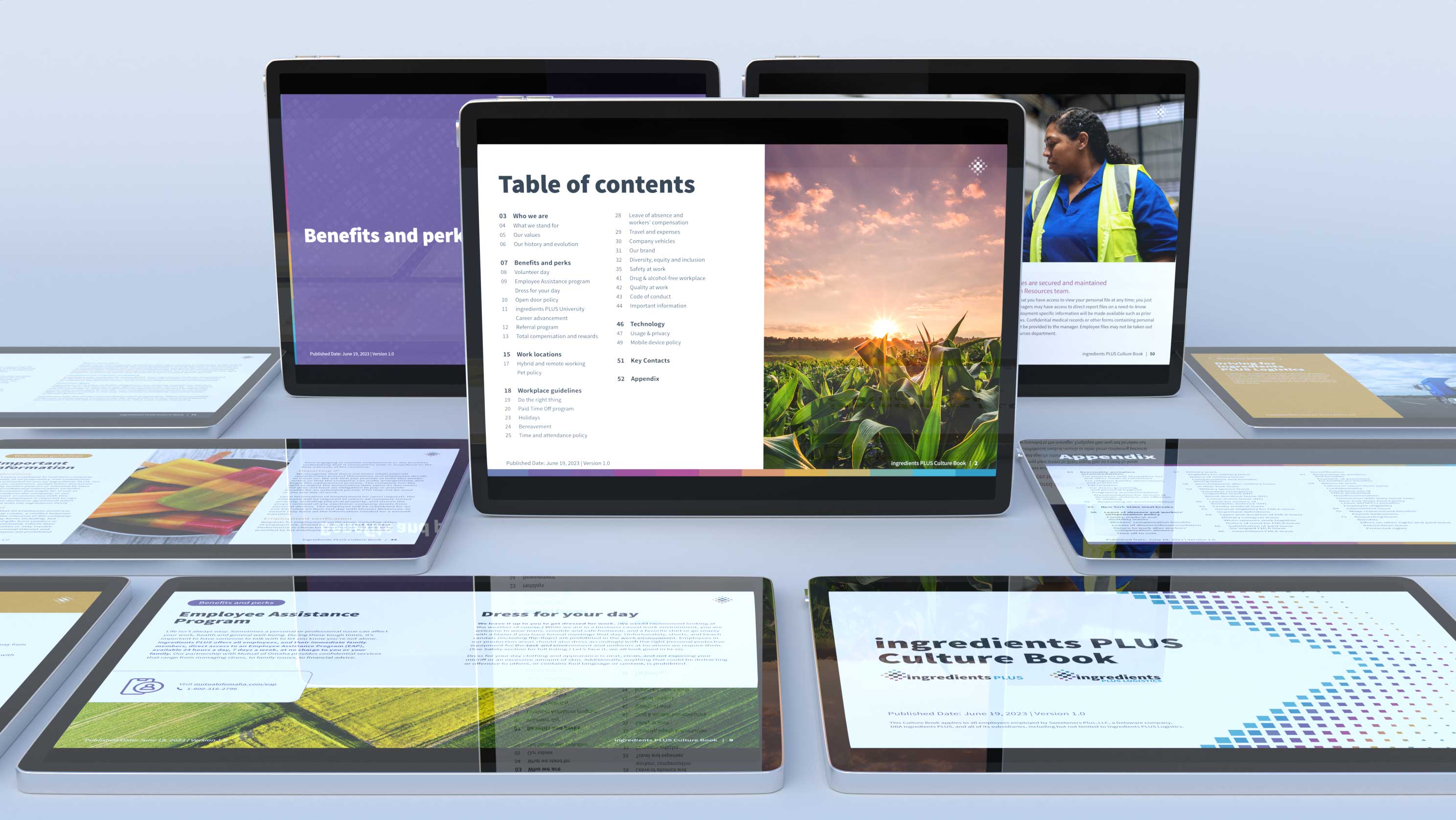
Our client's vision extended beyond a mere update; they sought an employee handbook that not only mirrored the rebrand and the company's enhanced services but also facilitated easy comprehension. Moreover, they emphasized the need for both print and digital versions, catering to the diverse needs of their workforce, including contractors and truck drivers who rely on tablets for their day-to-day operations.
Solution
Given the substantial size of the employee handbook, we initiated the project by presenting the client with a concise sample comprising 5-7 pages, showcasing layout options and imagery examples for approval. Once greenlit, we seamlessly transitioned into crafting the complete digital handbook, adhering meticulously to the updated brand and imagery guidelines. A thorough proofreading process was implemented to rectify any minor grammatical or technical errors in the content. Upon finalization of the digital version, we proceeded to produce and dispatch the print edition.
Key features:
- Distinctive chapter colors and tabs facilitating swift navigation, all in alignment with the brand's identity.
- Carefully curated full-color imagery to maintain a visually engaging balance and prevent text overload.
- Strategically placed content callouts injecting freshness and dynamism into the layout.
Feedback from the client was overwhelmingly positive, with a notable uptick in employee morale attributed to the modernized brand refresh. The professionally branded collateral served as a cohesive extension of the company's revitalized identity, garnering praise and fostering a renewed sense of pride across the organization.

